Rediscovering Sensation Through Structure
在結構中,重新找回感受
Balance
Daily care is regarded as an act of building inner order.
Each bottle marks the beginning of a stable structure.
Structure is not only order—it is the core of design.
Contrast
The interplay between rough and smooth, nature and the man-made,
rigidity and softness,
light and shadow.
Nature
Care is more than application—it is a ritual of dialogue between the body and the self.
Returning to the natural environment,
the product expresses its deep connection with nature in an organic way.


Visual Guide — New vs. Existing Product Comparison
Soft Tube Emphasizes a lightweight, flexible, and easy-to-squeeze design. Ideal for portable, on-the-go use, allowing effortless access anytime, anywhere.
Hard Bottle Designed for stationary care rituals. Offers a more ceremonial and stable usage experience, suited for calm, contemplative home environments.

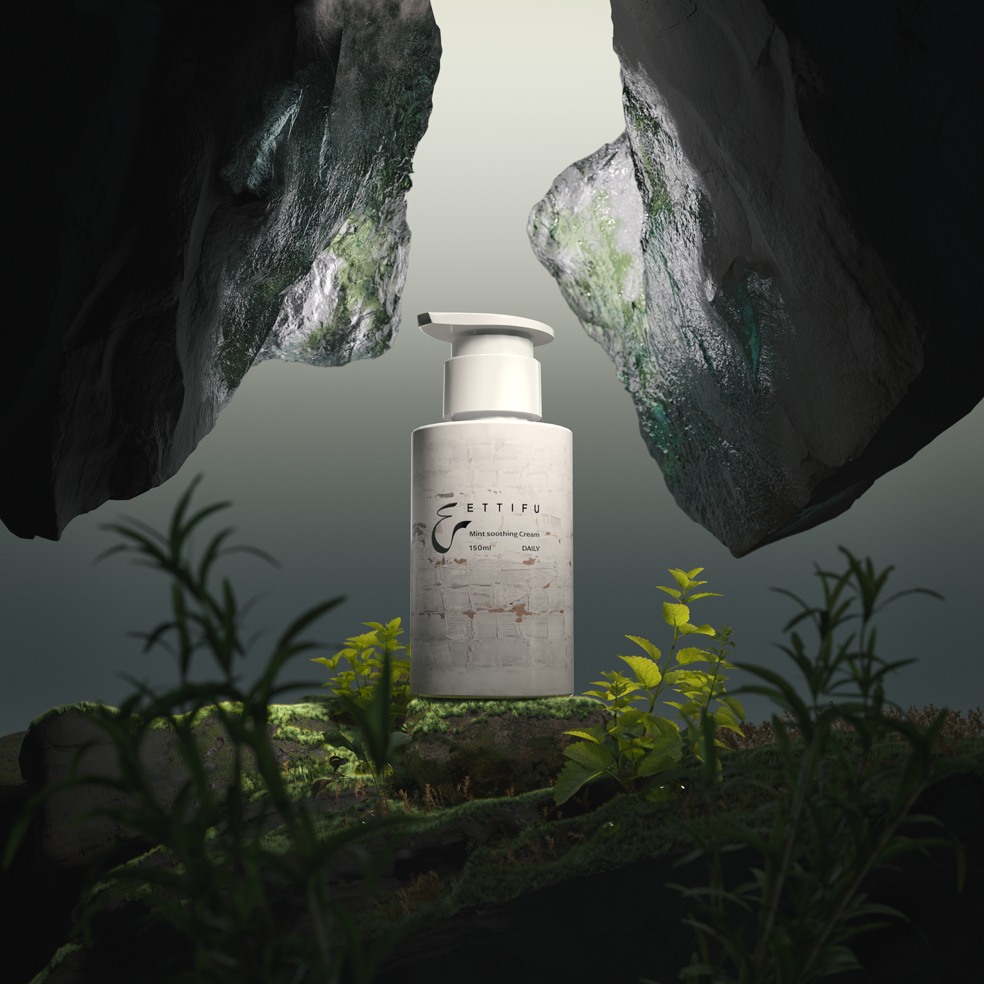

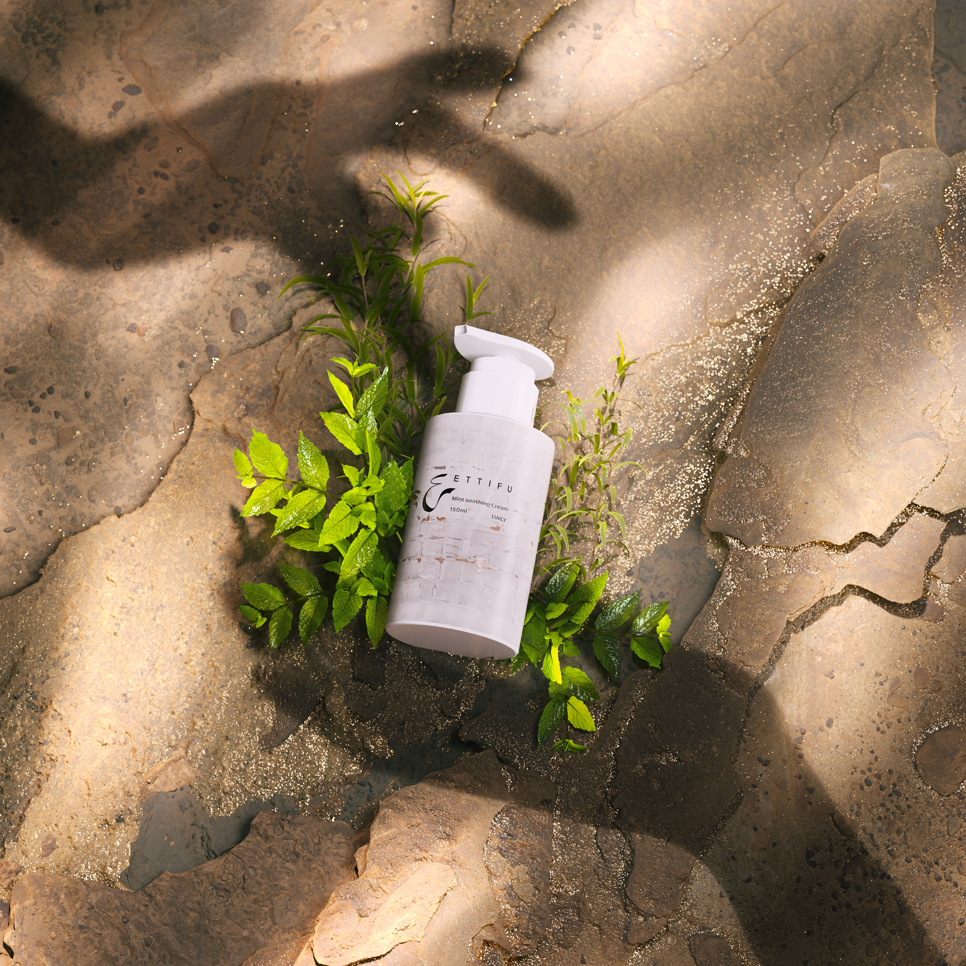
Product Photo_01 — Day Cream
Composition The day cream is suspended at the center of the frame, seemingly defying gravity. Accented with mint leaves and botanical elements, the composition introduces softness and builds a mysterious, surreal atmosphere.
Color Tone A dark palette with strong contrast is employed. The rock surfaces appear rough and shadowed, contrasting with the product’s smooth, luminous finish, highlighting the purity of the subject.

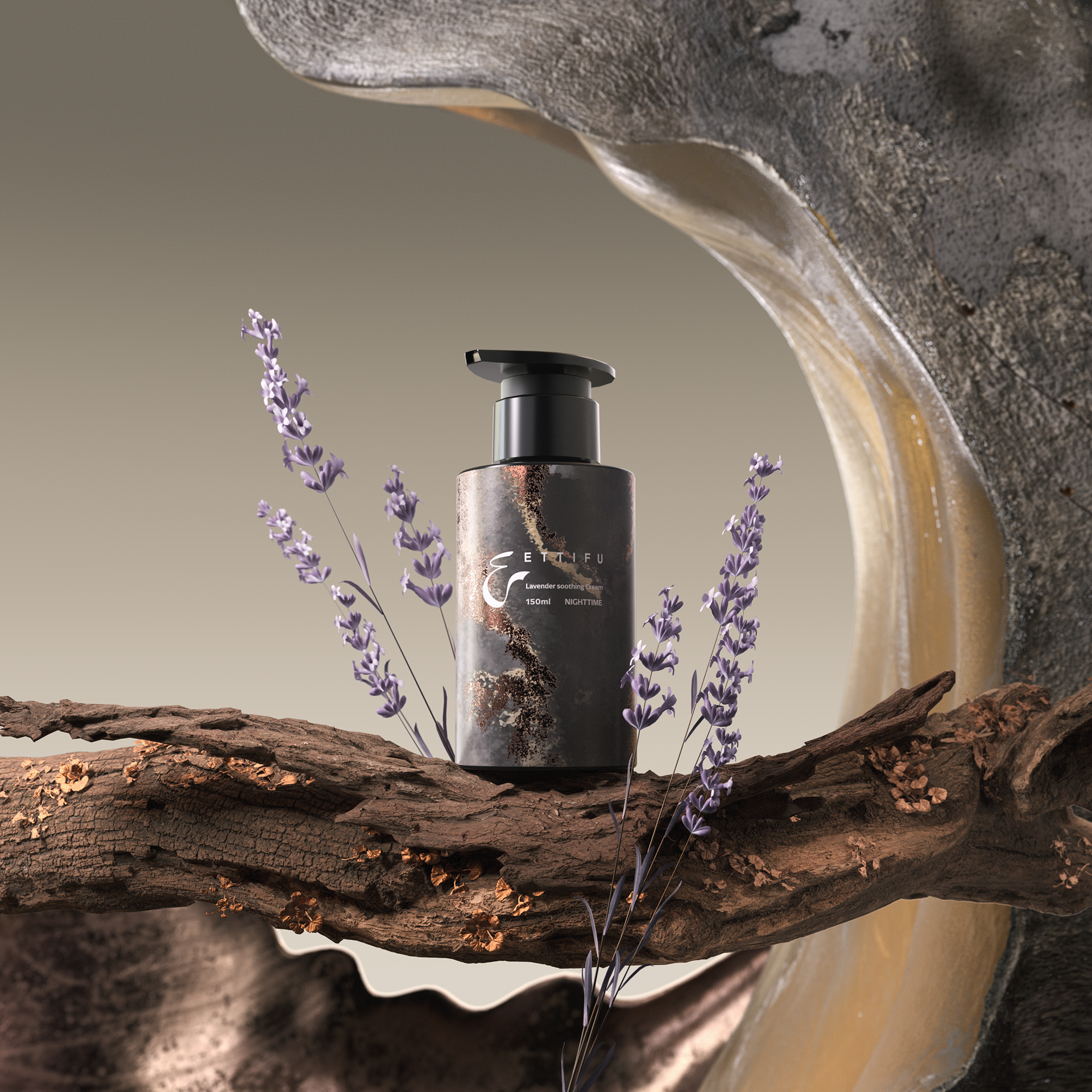
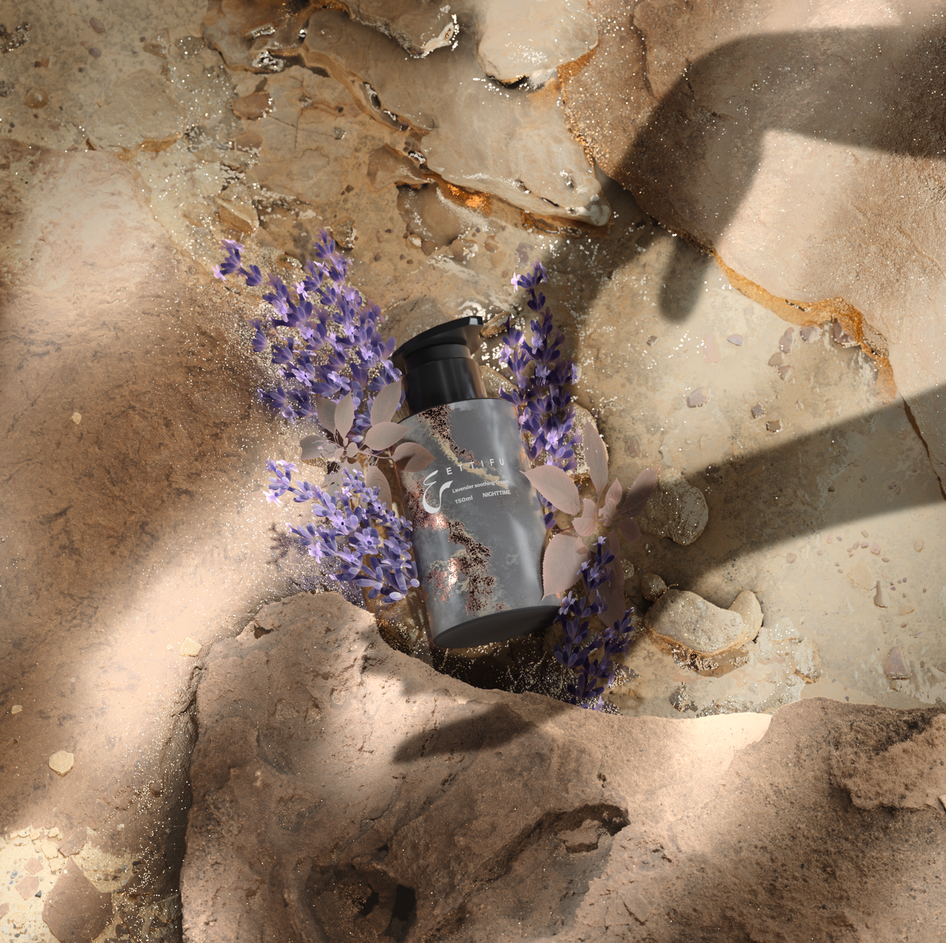
Product Photo_02 — Night Cream
Composition The rock formation and flowing structural elements in the background create a contrast between softness and strength, enhancing the product’s sense of refinement and stability. Slender dried florals are arranged asymmetrically on both sides of the frame, shaping a natural, breathable spatial atmosphere.
Color Tone The black container stands in strong contrast against the warm white, smooth surrounding structures, resulting in a minimalist yet visually dynamic aesthetic.
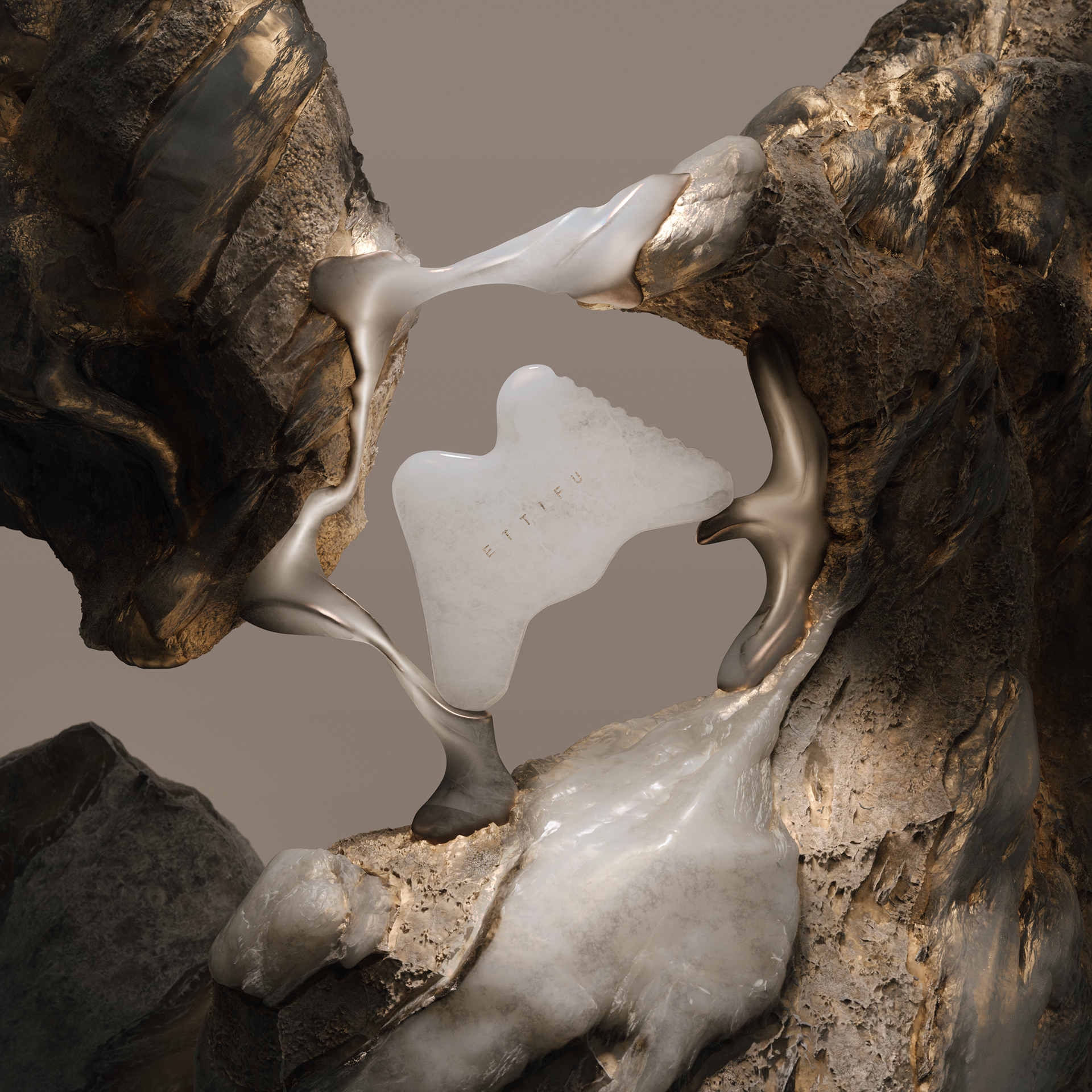

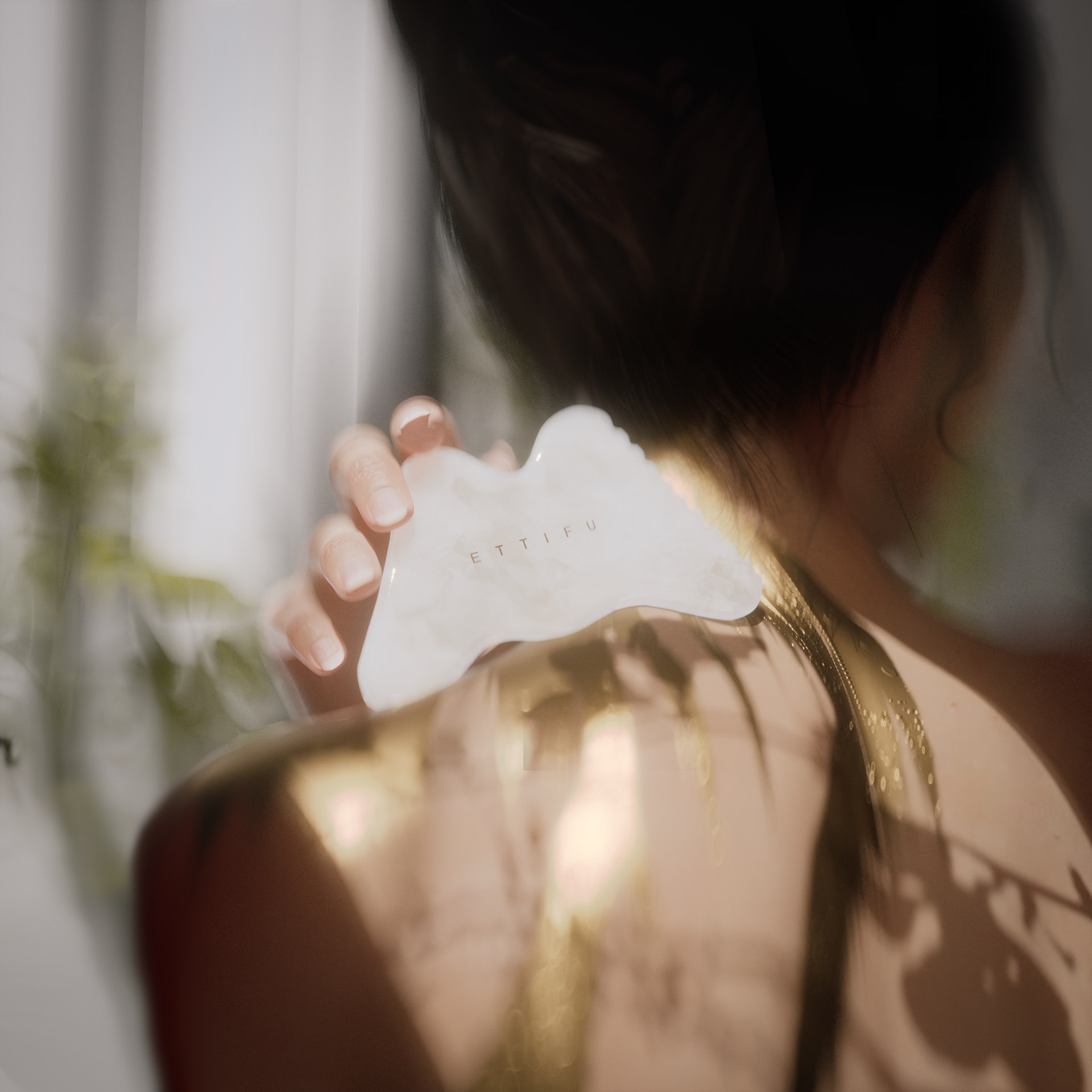
Product Photo_03 — M-Shaped White Jade Gua Sha Board
Composition The composition illustrates how a rigid object is seamlessly integrated into its surrounding environment, creating visual stability and strength while preserving the elegance of soft, flowing lines.
Color Tone The black container contrasts sharply with the clean, smooth white surrounding structures, resulting in a minimalist yet visually tensioned aesthetic.

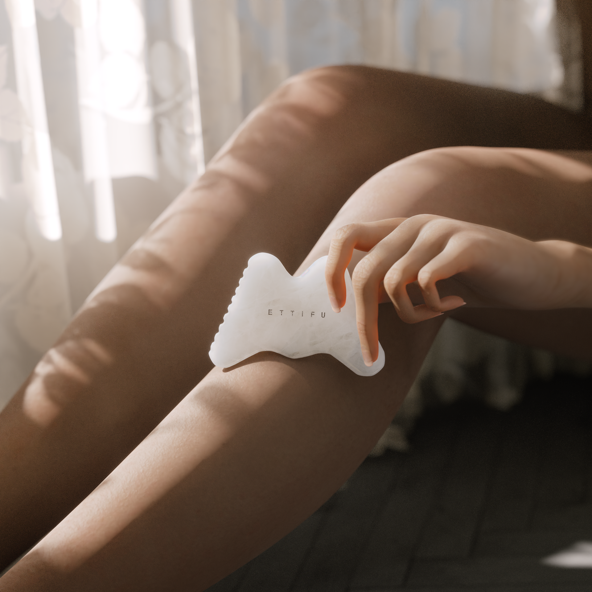
Gua Sha Board / Body Interaction
Shadow is not merely a play of light and form, but a metaphor— suggesting the tactile quality of skin,
sensory connection, and intimacy.
Through the shadows of botanical or organic patterns,
Through the shadows of botanical or organic patterns,
the human body is linked to natural elements and the product itself.

Day & Night Cream / Body Detail Close-Ups
Natural terrain, human shadows, and botanical elements are seamlessly intertwined with the products,
forming a harmonious union between body, nature, and form.

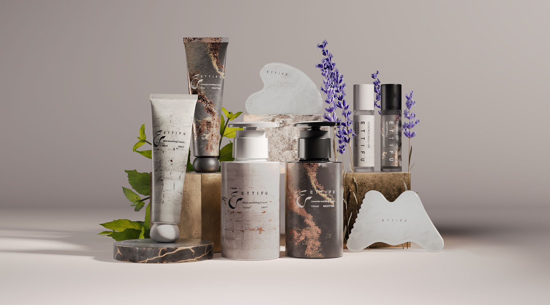
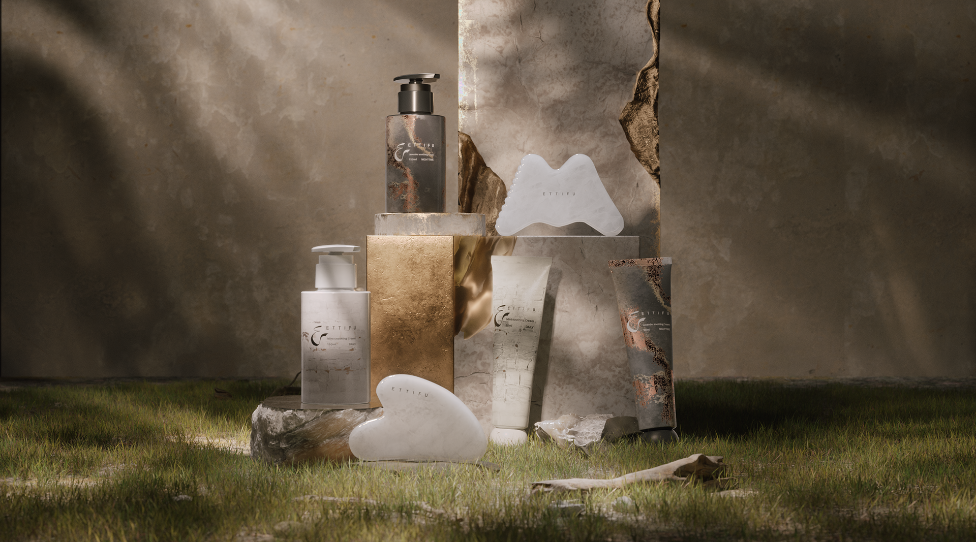
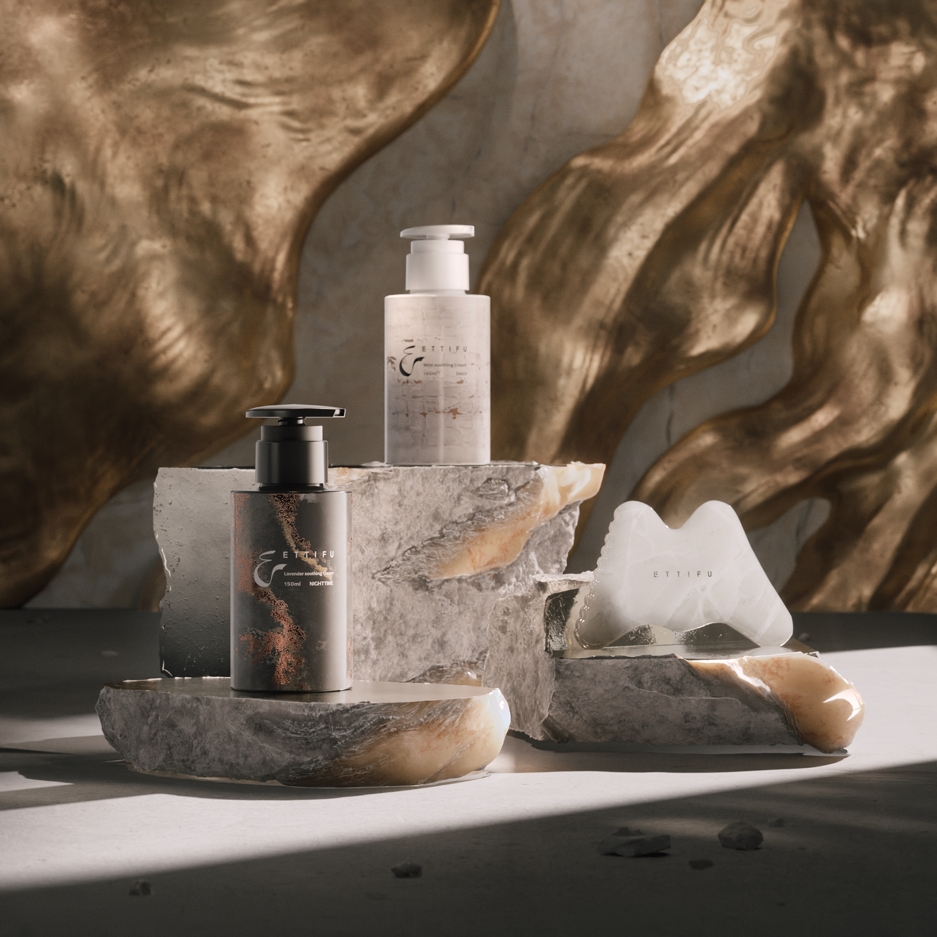
Full Collection
Composition A combination of natural light and soft illumination conveys both an indoor, home-like atmosphere and the presence of the outdoors. The use of mixed materials and natural botanicals expresses a refined yet organic aesthetic.
Color Tone Soft side lighting is applied without harsh shadows, allowing material textures to be rendered with subtle detail. This lighting approach reveals the distinct qualities of metal, wood, and floral elements.

Day & Night Roller Serum
Composition A centered composition places the bottles at the visual core of the frame, creating a strong focal point. The black and white bottles form a clear contrast, arranged in vertical correspondence, while natural botanical elements are scattered around them.
Color Tone A neutral, low-saturation background is used to establish a refined and natural atmosphere.
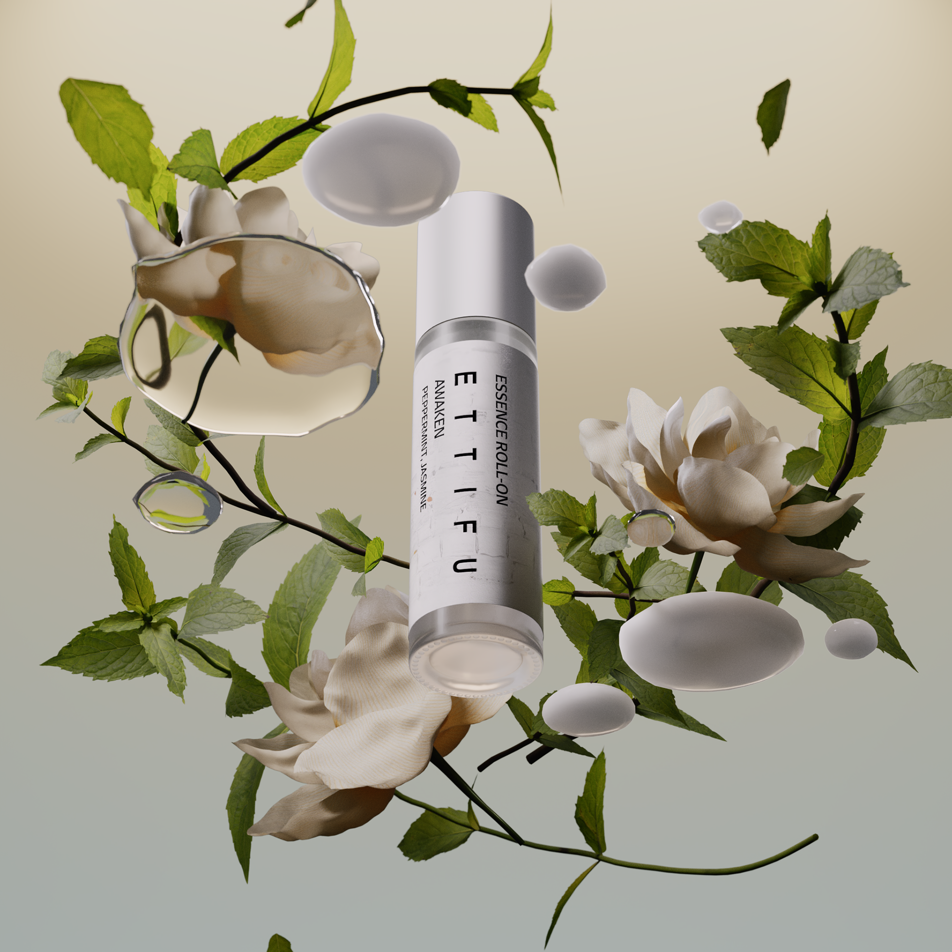
Day Roller Serum
Composition A refined gradient backdrop is paired with reflective mirror or transparent planes, creating reflections that allow the product and natural elements to appear as if floating in midair. A low-angle perspective emphasizes a sense of lightness and effortless elevation.
Color Tone Scattered water droplets, mint leaves, and jasmine disrupt the purity of the background, introducing a natural freshness and vitality. The primary palette features cool blue-green tones, echoing the crisp, refreshing character of mint.
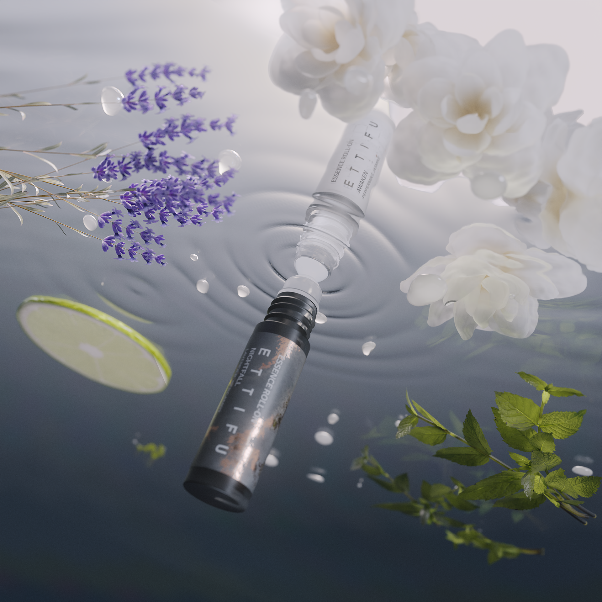
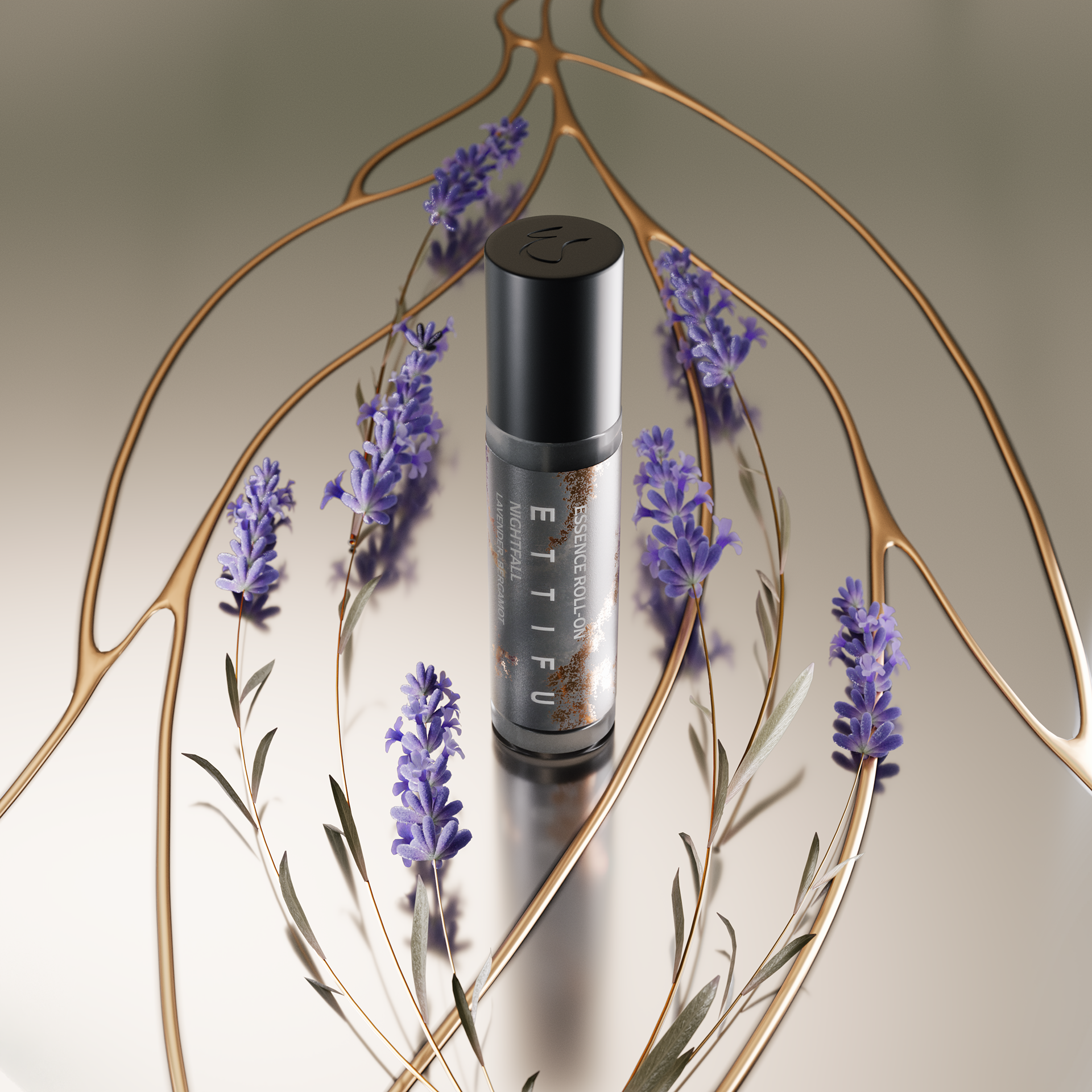
Night Roller Serum
Composition A centered top-down composition allows the metallic curves to function as visual guiding lines, leading the eye across the frame. Subtle accents of lavender sprigs are scattered around the product, creating a naturally dispersed, organic atmosphere.
Color Tone The palette is built around white, champagne gold, and light gray, with no harsh contrasts, conveying a sense of purity, nature, and refinement. Soft lighting without pronounced shadows highlights the textures and the form of the bottle, emphasizing the gentle, calming qualities of nighttime skincare.

CREDIT
CREATIVE AGENCY|AGE CREATIVE LTD.
DESIGN DIRECTOR|KF CHO
PRODUCER|PARKER SHEN
PROJECT MANAGER|COCO LIN╱XUE0
CG ARTIST|KF CHO ╱ SMUG XIE
COMPOSITING|KF CHO ╱ SMUG XIE